PokiPlanet is a Pokemon Trading Card Shop & Blog completely developed by me using HTML, Tailwind CSS, JavaScript, and Go.
Ideas #
I started with a simple concept, at the bare minimum the website needed a header, navigation links, main section, shop section, blog section, and a footer.
I began working from the top down, starting with the header and navigation links, and then the main section. The idea was to create something visually engaging and intuitive for users who are familiar with the world of Pokémon Trading Cards.
Style Concept #
I wanted the style to be consistent with the colors and feel of the Pokémon Trading Cards, so I incorporated rounded edges, which is a signature trait of the cards themselves.
Interactive Card Display #
For the main section, I wanted the website to be as interactive as possible. My goal was to replicate the feeling of flipping through a stack of Pokémon cards as a user would in real life.
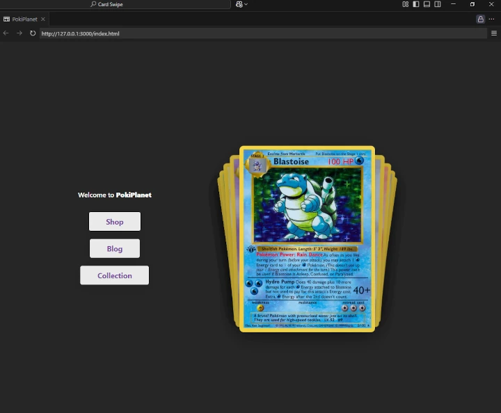
I added an interactive feature that allowed users to swipe through a stack of Pokémon cards. But it didn’t stop there. I thought, why not make the background change depending on which card is currently being displayed?
So, I designed gradients based on Pokémon card background patterns—one for each Pokémon type—and used an event listener to track which card was being displayed. The background would then swap to match the selected card’s type.
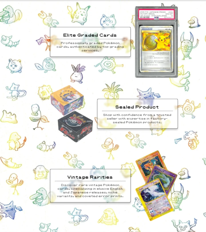
The Shop Section #
Next, I tackled the shop section. I needed to show off what customers could expect to be sold across the site. I wanted the shop to feel authentic and connected to the roots of the Pokémon Trading Card Game (TCG), so I chose a background from a scan of an old Pokémon TCG book, sometimes referred to as “The Silver Bible.”
This book is known for its wealth of information about the early days of the TCG, as well as some incredible artwork by the original artists, making it a perfect fit.
The shop section was divided into three categories:
- Graded cards
- Sealed products
- Vintage cards
I also added a scrolling testimonial slider that showcased some recent customer reviews.
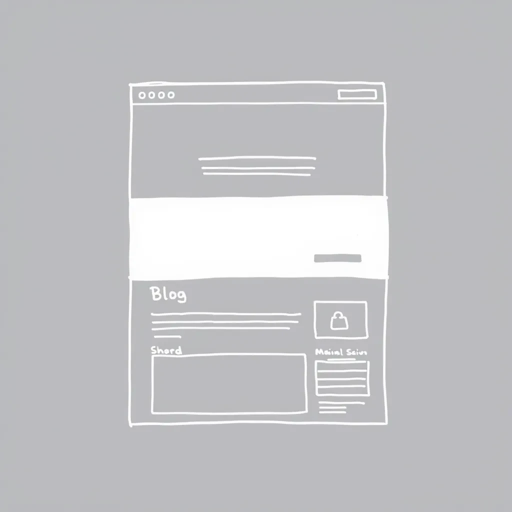
The Blog Section #
The blog section was one of my favorite parts of the design process. I took inspiration from the retro GameBoy game Pokémon TCG. The game’s intro features the Pokémon types spinning around the logo, and I wanted to replicate that with floating “orbs” behind the blog section link.
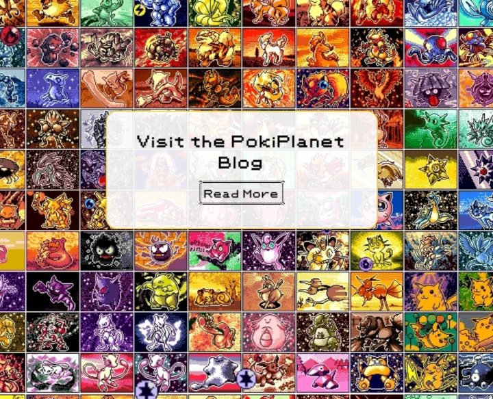
For the background, I used a sprite sheet of all the cards from the game and combined them into one large wallpaper. This added a nostalgic, retro feel to the page.
The Footer #
The footer was kept consistent with the header and navigation links. The colors were matched to resemble the borders of a Pokémon card, and I used rounded edges to give the impression that all the sections of the site were stacked cards on top of one another.
While I had a lot of fun creating this version and was able to let my creativity run wild, in hindsight, I should’ve kept better control of the code. In the end, there were a few too many bugs I needed to iron out, and I wanted a more professional design.
Revision #
After creating the first version, I realized that I had a great baseplate to work from—if you could call it that. This time, I made sure to have a full plan, and I aimed to use Tailwind CSS to keep my code clean, fast, and easy to maintain.
The result is the cleaner, more polished version of the site that you can see now at PokiPlanet.com.
The changes I made include:
- A simplified main section with a cleaner card layout and smoother animations.
- A redesigned shop section with updated product cards and hover effects.
- A new, more professional footer with useful resources and links.
- Improved testimonial sliders that function more smoothly.
The Blog #
For the blog section, I decided to use Hugo, “The world’s fastest framework for building websites.” Once you get the hang of it, Hugo makes adding blog posts smooth and fast.
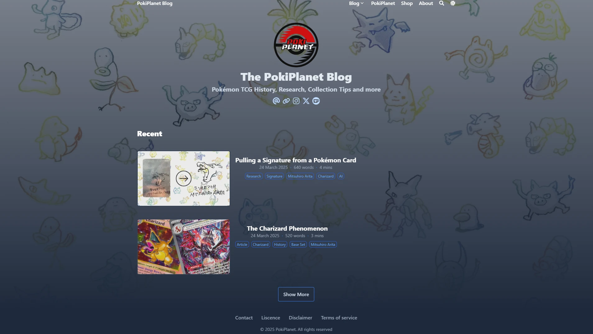
For the theme, I chose BlowFish and customized it to suit the website’s look. If you’re curious, you can compare the blog you’re reading right now with the one on PokiPlanet.com since both are built using Hugo and the BlowFish theme. My personal blog is less customized, but you’ll still see some similarities.
Final Thoughts #
I really enjoyed making this website, despite getting caught up in browser console errors and weird device positioning issues. In the end, though, I’m very happy with the results.
Building a site from the ground up, especially one with as much detail and personality as this, has been a rewarding experience. If you have any feedback, feel free to leave a comment below! 😊